If you’re a frequent reader of this blog or just someone who’s accidentally popped in because your garbled search engine text landed you in the wrong place, you’re probably asking why another post about book covers? It’s not by design, but rather something I’ve taken to calling the unintended inspiration of an otherwise content mind, i.e., I needed to get out of a lazy funk.
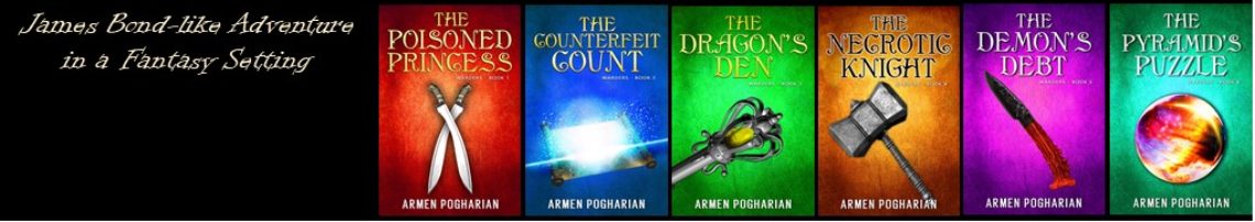
In my previous post book covers, I wrote about redoing the first cover for my Warders series to create a recognizable series look. As a relatively new series, the first book came out in November ’13, there wasn’t a lot of brand equity to lose. I liked the original cover, but I like the new one more. In a rare confluence of events and talent, this was a definite no-brainer decision.
That was not the case with the pending release of Misaligned: The Darkest Day, book 3. Unlike the Warders, Misaligned is an established series that’s been available for more than two years. The first book covers created an image/brand for the series. The brand includes the Celtic triskele symbol, similar fonts, a predominant color scheme (green for book 1, orange for book 2), and several characters.


The new artist easily handled most of those elements, but the image of Penny Preston, the lead character and most prominent feature on the covers, presented a special problem. Other than the specific images used for the first two books, we did not have access to the original artwork, which was lost in a computer crash. Given Penny’s central role on the covers, I felt we needed to include her on the third cover and that we shouldn’t change her appearance. We could attempt to recreate her image hoping that any differences could be hidden or unnoticeable; or we could reuse one of the earlier images in a different setting.
After some debate, we settled on re-using the image from the first cover. To make it a little different, we moved her to the right side of the cover and added the raven character (Master Poe) on her shoulder. We briefly considered changing the color of her clothes, but decided the original colors worked. For the rest of the cover we retained the Celtic triskele and font as well as a basic color scheme (purple this time). Additionally, the background of stars and the ethereal image of King Arthur reflects back to the first cover which uses general images rather than a specific scene from the story as on the second.
Having said that….play faux drum roll loop in your head….here’s the cover for Misaligned: The Darkest Day
 I was leery of re-using the image from the first cover, but I really think it turned out as well as could be expected. What do you think? Please share your thoughts in the comments section below.
If you’re interested in picking up a copy, please visit the where to purchase page of this site. You can select from all the popular e-book formats and even purchase directly from my publisher. Going direct costs the same as buying from the big retailers. However, you’ll have the satisfaction of putting more of your hard earned cash in my pocket instead of theirs.
Early Review
As always, thanks for reading.
Armen
Given the circumstances, using the original image of Penny seems reasonable. The setting is quite different from the first book, so one might not quickly recognize the re-use. I think the cover looks fine. Congrats on the release of your third book.
Rick………..
Thanks, Rick. We were hoping that the covers would be different enough that the image re-use wasn’t too obvious. I’m glad it worked for you. I hope it works for many others, too!