Back in April, I posted about the importance of book covers in selling books. Given the number of hits for that blog, readers may ask why I’m returning to the subject. It’s a fair question. For those who didn’t read it (or have submitted themselves to hypnotism, experimental drugs, or extended stints inside an over-driven MRI to erase it from your memory) the blog ended with a question about the cover art for my high fantasy series, The Warders.
Specifically, because of a change in artists at my publisher, SynergeBooks, there were significant stylistic differences between the two covers.
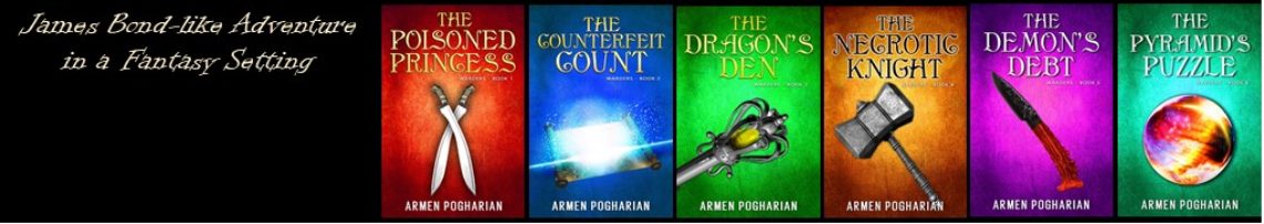
Original Covers


As you can see none of the three basics of a book cover (title, artwork, & author name) are similar in any way. Other than the subtitle, there’s no way to know these books belong to the same series.
Before I go any further, let me be clear that both my publisher and I each approved these covers. So I’m not complaining about the artist. That said, based on feedback from readers, fellow authors, and my own gut (which sadly is growing but at least it’s also getting wiser), the second cover is superior to the first. Objectively, the title font is larger and more readable. Subjectively, the images are cleaner with a less computer generated look to them. Several commented that it grabs the reader’s attention, which is exactly what I want in my covers.
With that in mind I convinced my publisher that we should redo the first book in the series to align more closely with the second.
Redesigned Covers

Artistically, the moon and darkness of the two covers makes it easy to connect these two books. The element layout remains the same. The title in the top third, image in the middle, and the author name at the bottom. Acapella Book Cover Design, also ties them together by using the same font, but with a different color. We’ll continue this theme for the rest of the series featuring similar artwork, the same layout, and varying the color of the font.
Did we succeed in creating a visual brand for the series? Obviously I think so, but what do you think? Will the change lead to greater sales? I don’t know. Once the new cover is released it will probably take a few months before I see any results.
As always, thanks for reading.
Armen
A wise decision, in my humble opinion. I like the 2nd cover. It looks more professional to me than the original cover on the 1st book. Also, by showing the original cover of book one (as compared with book two) then the new cover of book one, it seems instantly clear – at least to me – that the two books are part of a series. Good move.
Yes, I think it’s pretty clear, too. As always, thanks for taking the time to read and comment.
I agree the change was a good thing. Without reading this post I was taking a double take. Not loving book one as much as two. Not only did they not mesh, the first one seems a bit stiff. I do like your new one much better. Much better though I am not sure about the building. Could it be a bit lighter so you can really see what it is? It’s kind of dark and is a bit of a blur unless you look closely. Thinking there could be some highlights on the building. That being said, I do like it very much and love that they look like they belong together. I love book two. It pops and grabs my attention. The fonts are nice. Good wishes. I am certain the contents are even better than the great covers. 🙂
Brenda – thanks for your thoughts. I know what you mean about it being dark. To some degree it depends on the computer you view it on. I’ve looked at it on four different machines and it looks different on each one. I even ran a recalibration on one of the computers. I had similar issues with the other cover, too. In the end I decided to trust the artist and my publisher.