
With the publishing rights for the Warders now mine, I decided it was time for a book cover redesign. Not because the old covers weren’t good, but like a Mamie Eisenhower bathroom, some things just need updating. While we all know it’s best not to judge a book by its cover, we also know that everyone does it.
With that in mind, a book’s cover must grab the reader’s attention enough for them to take a deeper look. While there are many ways to slice it, to me there are four basic elements to the cover.
Font, color, and positioning of the title
Central image
Author name
Secondary images, background, foreground, and color
For print covers there is also the information on the back of the cover, i.e., tagline, blurb, author info, etc.
The Process
All right, with the basics out of the way let’s dive into the process. Many authors buy pre-made covers or create their own using Amazon’s tools. Their results are often quite good. I spent many hours browsing various sites looking at some wonderful artwork. Unfortunately, none of the pre-made covers fit the series. Even the few concepts created with a series in mind, didn’t have the feel I wanted.
At this point I ran into some good luck. I reached out to the original artist for the Warders series, Jennifer Givner of Acapella Book Cover Design. We had a good working relationship through my previous publisher. After some preliminary exchanges, we found common ground on design and price.
Original Covers
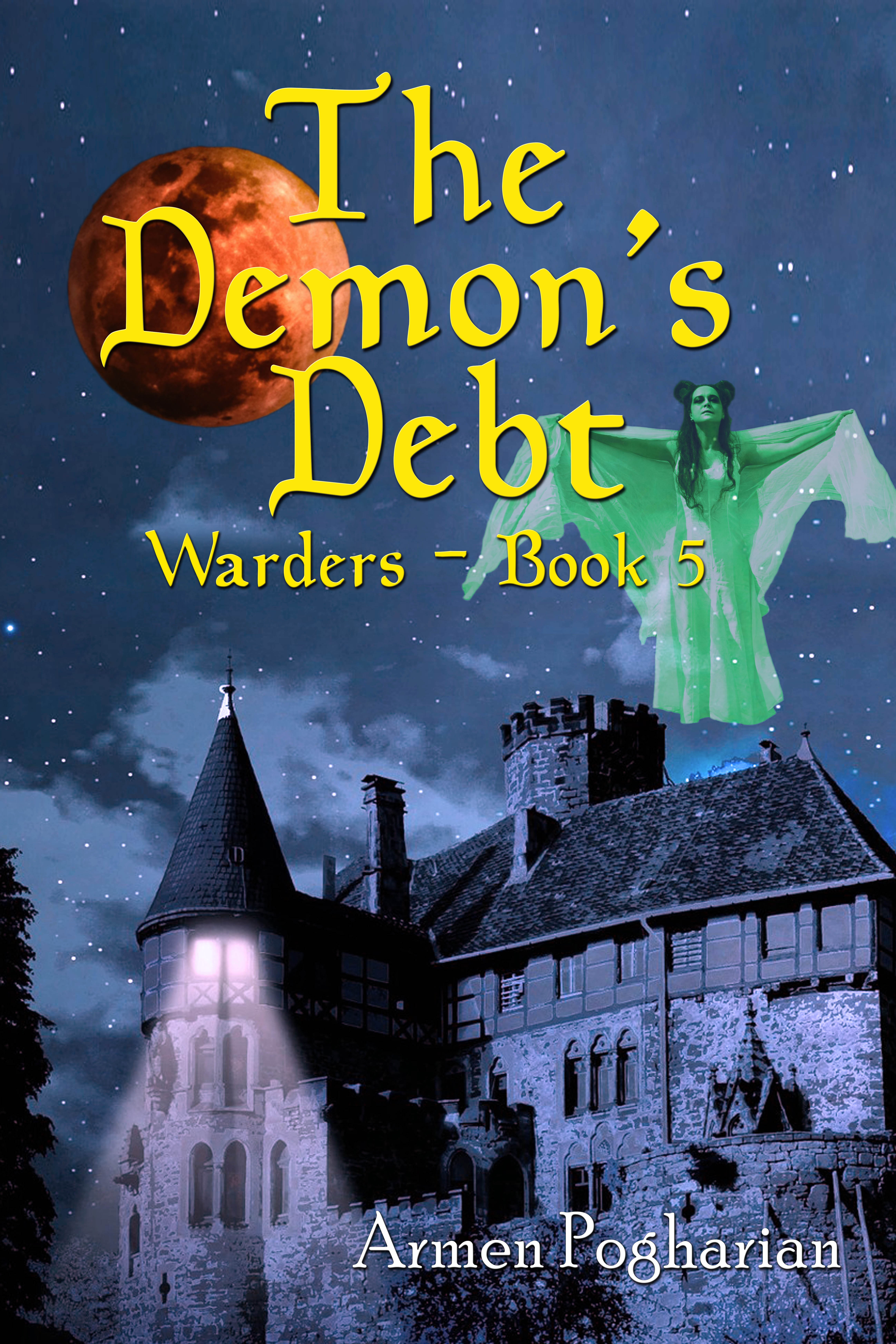
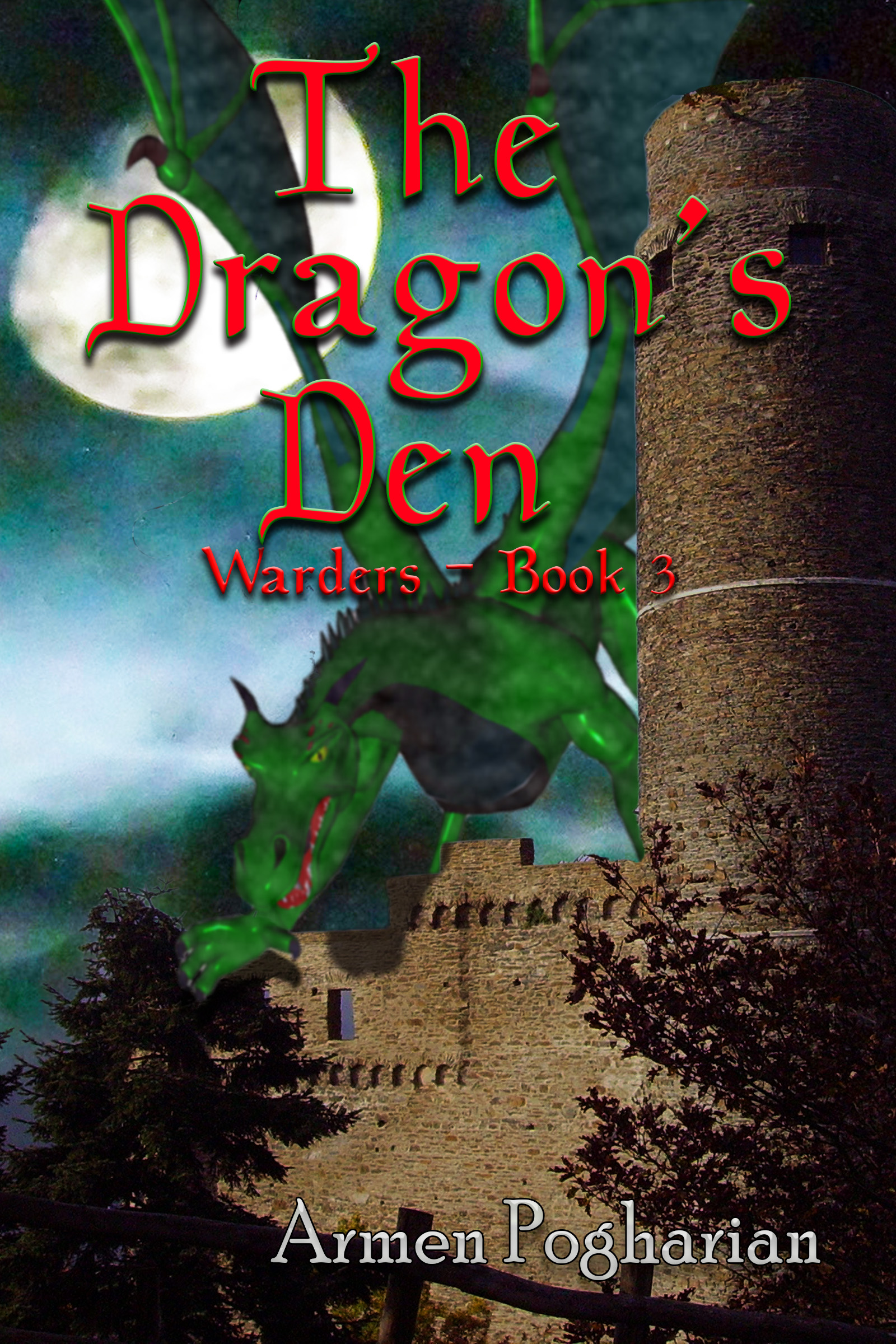
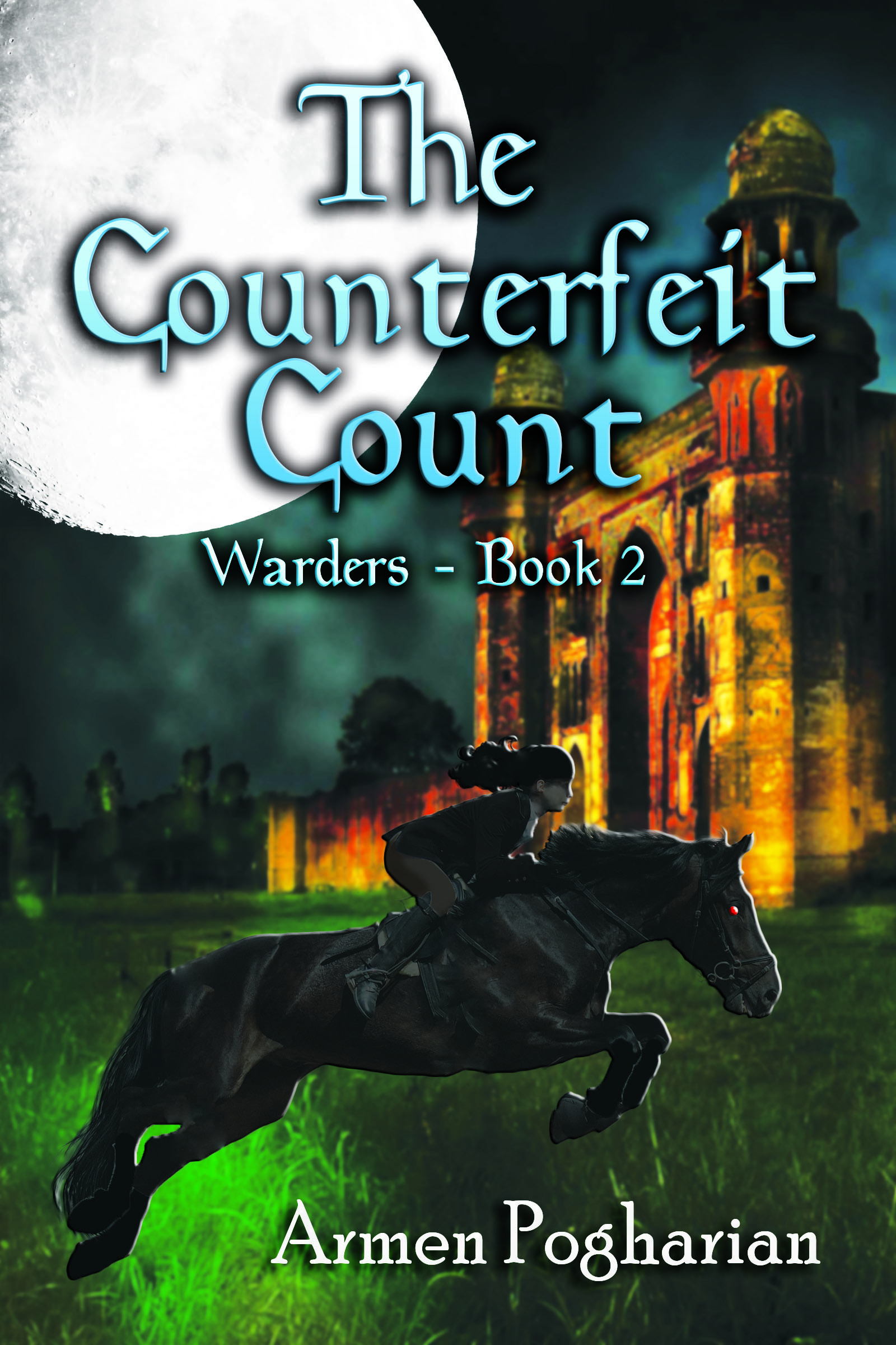
Before revealing the new covers, here are the thumbnails of the original covers including the unreleased book #6, The Pyramid’s Puzzle. Besides the fonts and placement of text, each of these covers features a character/creature from the story with a background or foreground image. The full moon on each cover makes the series connection.


Updated Covers
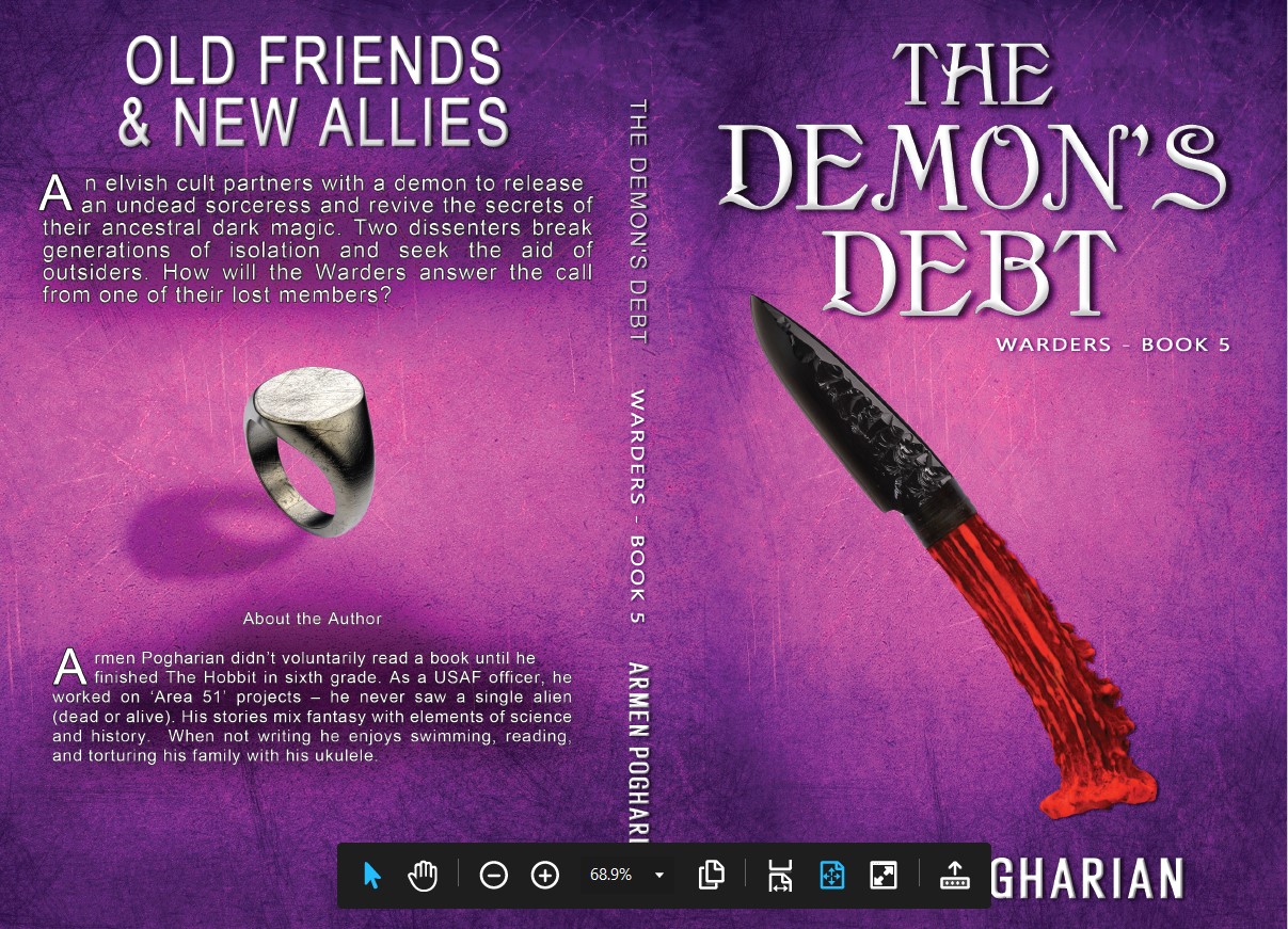
To keep the costs down, we streamlined the design. Each cover features a single central image set against a textured background color which varies by book. The title and author fonts are consistent across the series with minor variations to highlight visibility. There are no secondary images on the front of the cover. To enhance the series connection, the print covers all feature the same image of a Warders’ signet ring.
Okay, now for the post redesign covers. For completeness, I’ve included the full print covers. The main image now features an item or object central to each story. The ring tie-in only appears on the print versions. That’s more a plus for those covers than an issue for the ebook versions. The actual print files were pdfs which I converted to jpgs to share. I used the snipit tool, which resulted in some minor size differences. Also, the white spot on the back of The Dragon’s Den is to make sure the barcode is readable.


I hope you like them as much as I do. I cannot say enough about how wonderful it was to work with Jennifer Givner on these covers. Whether you’re looking to redesign an existing cover or create your first one, do yourself a favor and contact her at Acapella Book Cover Design.
If you have any questions, please don’t hesitate to include them in the comment section below. As always thanks for reading.
Armen
Note to pay the bills: If liked the covers and you’re interested in a James Bond-like thriller set in a high fantasy world, featuring a cheese-eating wizard, look into The Warders. You can find a summary of the series here or find links to purchase books here.